
Our 1963 A-frame vacation home was overall very
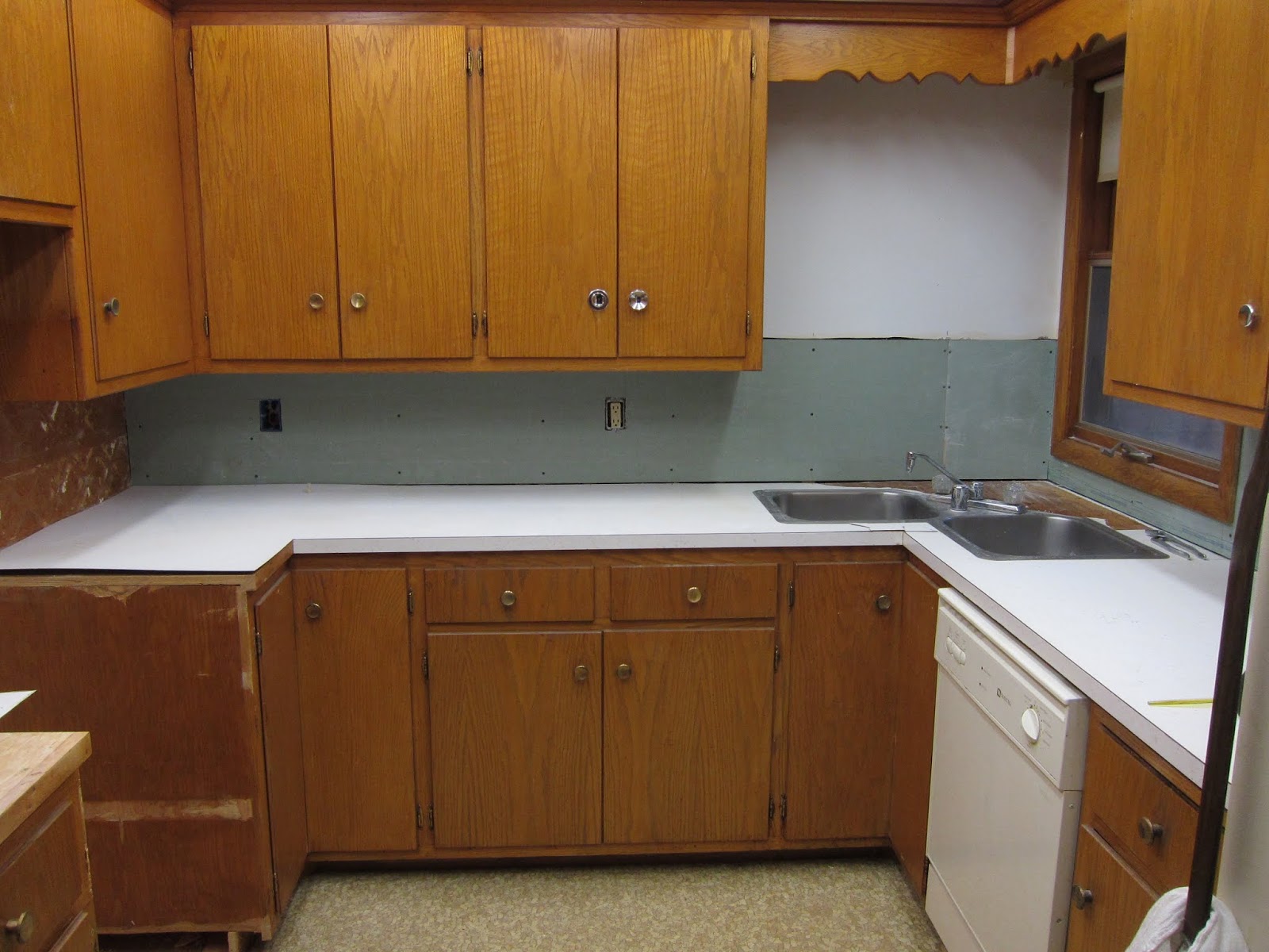
original. The kitchen was completely
original. It had light beige ceramic 4x4 tiles
on the walls and a brown oven, cook top and hood.
It also had multi-colored speckled laminate with a white
background. The cabinets were original
as well. The kitchen was in what I would
call good condition but unfortunately water had gotten under parts of the
laminate on the counter and it was starting to separate from the wood. There was some sort of leak by the faucet and
the wood supporting the sink was rotting out.
The cook top worked but the oven was shot. It is a small kitchen and so counter space
was limited. The rotting wood and
buckling Formica were the big drivers to refreshing the kitchen. I also wanted to see if we could maximize the
counter space as well.
We seriously started looking at the kitchen project in
2012. We priced out a new kitchen
counter top with the Formica Aqua boomerang pattern back when they still offered
it. The price came back at $1600 and
that was more than I wanted to spend. We
started researching do-it-yourself laminating.
It looked doable with the right tools.
So we put a plan in place.
Replace the laminate; replace any wood in the counter top that was
damaged. Replace the boring beige 4x4
tiles and maximize counter space.
Years ago, a friend of mine told me of someone
 getting rid
of a working vintage aqua oven. We went
and got the oven for free. This free
oven drove the color scheme of the kitchen.
I had always loved the HOJOs colors of aqua, white and orange. With the aqua oven we were on our way.
getting rid
of a working vintage aqua oven. We went
and got the oven for free. This free
oven drove the color scheme of the kitchen.
I had always loved the HOJOs colors of aqua, white and orange. With the aqua oven we were on our way.
Our first step was to remove the non-working oven.

We decided we would remove the cook top and the cabinets that were below it to make room for the aqua oven. This would allow us to repurpose the space where the wall oven had been.


We used a handyman to help us with this. He made the suggestion that we should reuse the doors from below the cook top and divide up the space where the wall oven had been. So he created an open space for the microwave to sit to keep it off our limited counter space. Then he attached the doors to the rest of the space to give us additional storage. I thought it was a great idea and I really appreciated his out of the box thinking.


There was an original wooden lazy susan in the corner
cabinet. They had used some newspaper to
line it and then something very sticky spilled on it so we had to replace
it. We went with a new plastic white
one. It really brightened up that
corner.


To change out the back splash we had to remove the 4x4
tiles. The wall with the cook top was
actually plywood, so I was able to chip off the tiles.


The other two walls were drywall or plaster
and there was no way those tiles were coming off while leaving the drywall
intact. So the handyman cut out the drywall on the
other two walls and replaced it with fresh green board.

Unfortunately they had brought the beige tile
out to the side on the oven wall and refrigerator wall. I could sand it but I felt we were either
going to have to tile back over it or come up with another solution to cover
it.

Next we tackled removing the buckling laminate. The goal was to leave the wood counter top
underneath in place. Where the laminate
was already popping up it was easy to remove.
Where the laminate was not popping up was a bit more of a
challenge. Unfortunately, as hard as I
tried, I did leave some divots in the wood that I was going to have to deal
with later. After all the laminate was
off, I used wood fillers to fill in any holes I created. Then I sanded the countertop down to be as flat
and even as possible.

After this burst of progress, things slowed down quite a
bit. A new job, my mom moved nearby and
life in general. Since we were not using
the kitchen full time it was easy for it not to be top of mind.
During this slower time, we decided to test our laminating skills. We had taken a wood working class a few years back and had made a small table. We decided this would be a good way to try out laminating. We purchased a laminate splitter which would help us accurately cut the small edge pieces. We got a pair of laminate shears to help with the actual cutting of the laminate. We also got a laminate trimmer to trim the overhangs. We purchased small round dowels and the adhesive.

We found a video on
You Tube and followed the instructions.
It turned out well. The only
issue we had is when we trimmed the top part of the laminate; it left some
small white marks on the edging. We
learned that we would have to be more careful when trimming when we actually did the
counter top.

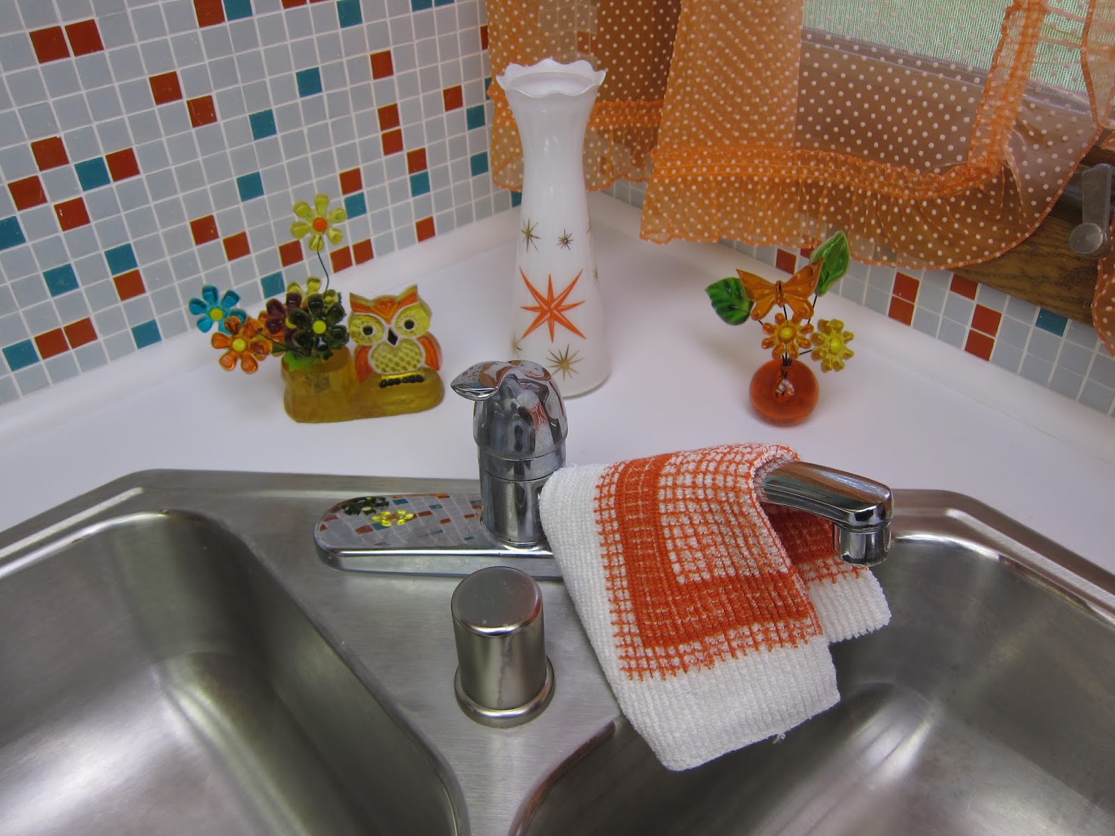
At this point, we had our color scheme which included aqua, orange and white glass tile and aqua boomerang Formica.

Where we really struggled was what to do with the cabinets. They were in pretty good shape but looked a
bit worn. We considered using the Rust-Oleum
Cabinet Transformation in a darker color. We even painted
some very large post it notes various colors to see if we could get a direction
on what to do with the cabinets.


Unable to make a decision,
we reached out to Pam and Kate at the website Retro Renovation to get their
opinion. We got a lot of feedback. It seemed to me, a majority of the feedback
was to leave the cabinets as is. As much
as I wanted an Aqua overload kitchen, we did decide that it would be best to follow the advice given by the hive and leave the cabinets as is. Here is a link to the story.
Progress ground to a halt again. With our small fridge and microwave, the
kitchen was functional so it got put on the back burner again.
In August of 2015, we saw an ad for an estate sale. It featured an aqua refrigerator, 1961
General Electric model tb-364. We waited until the second day and they had
25% off. It looked to be in great condition. My favorite feature is the swing out
shelves. We bit the bullet and bought
it. We had to rent a truck to keep it
upright during transport. It was heavy
as heck so we had to have a friend help us get it down the 30 steps from its
original location.


During this second slowdown, we spent time painting the interior
of the cabinets. We went with a plain white
paint.

Late in the summer of 2016, we got ambitious and decided to see
if we could get the laminate done. This
required us to make a final decision on the laminate we wanted to use. We decided against the aqua boomerang. The aqua was a bit off, color wise, with the
oven and refrigerator. We decided to go
with white, keeping the color palette a bit simpler than originally planned. There are many shades of white but we decided
since it was such a small kitchen with just the one small window, we would go
with a nice, bright white.

Before we could install the laminate we had to address the
rotten wood by the sink. The sink is in
the corner so it was a tricky fix.

We removed the section that was rotten.

We saved it and used it as a template to cut the new wood.

We used braces to attach it to the original wood and we installed small blocks of wood underneath to give it good support.

Now we were ready to install the laminate. We
calculated our pieces by figuring out the least number of cuts needed. Because of the nature of the corner sink, we
had to figure out the best option for cutting the laminate for that area. We knew to cut a diamond pattern out of the
laminate would be tough. So we cut it so
that the seams would meet by the edge of the sink and then we could cut the
small pieces to fill in around the sink.
Overall, I would say the cutting, installing and trimming went
well. We used the same video as we did
for the small table and that was very helpful.

The overhead lighting in the kitchen is a grid made of
matching redwood from the family room.
It originally had the thin, plastic light panels that had yellowed and
chipped over the years. We researched
our options and found lightweight polycarbonate panels. They had a ribbed pattern. The selling point for us was the fact you
could cut them to size with a pair of scissors.
They were super easy to install and we love the look of them.


Initially, we had planned on putting the glass tile over the
plywood on the one wall. It was just not
even enough so we had to install green board along that wall. The first board we cut was too tight of a fit
and so it broke when we “pushed” to make it fit. So a second board was cut and that went in
fine. The tile we had was purchased
years ago from Mosaic Tile Supplies. We
used their tile maximizer to create the mix of aqua, white and orange that we
were looking for. In hindsight, I wish I
would have picked a more turquoise shade of the tile than aqua. The oven and refrigerator lean more turquoise
than aqua. Also the “white” tile took on
a blue/gray tint when installed. It was
not quite as white as it showed in the pictures online.

The tile came with a paper cover. You installed it then used a wet sponge to
get the paper off. I don’t know if it
was because we had the tile for so long but in spots we had a bear of a time
getting the paper off the tile. It
wasn’t the easy “wet it and pull it off” that we saw in many videos. There were times I had to take small pieces
of wet towel paper and put them on the leftover bit of paper until they soaked
enough to come off. I broke many a
fingernail trying to get that paper off.

I had to make the call on whether or not to tile the entire wall that the stove was on or just tile directly behind the stove. My husband and nephew voted to do the whole wall but I made the call to just tile the area directly behind the stove. I felt like this would be more visually interesting and allow the tile to stand out more. After tiling the other two walls, I was very happy we decided to just tile the part behind the stove. Tiling is not easy work!

We ran into a problem with grouting. Due to the tile being glass, there were small
holes and divots in the tile. The grout
would settle into those spots. I used a
toothpick to try to get it out but it became an overwhelming task. So we wiped off as much of the grout as we
could but had to leave some of the grout in the small divots. Overall, I was happy with the tile job. Somehow we did miss one tile that had really
gone cock eyed. By the time we found it
there was no going back, it had dried in place. My theory is that it is there as a reminder
that life is full of small imperfections!
We then installed a new sink, faucet and garbage
disposal. We painted the open area near
the sink and on each side of the stove Holiday Turquoise by Sherman Williams. We installed new cabinet knobs that I had
found out thrifting. There were 25 knobs
to replace. I had about 15 in perfect
condition, so I put those at eye level.
The others I used on the higher or lower cabinets as I felt that their imperfections
would not be as easy to see.
We considered using metal edging to "pretty up" the area where
the wall met the counter top. In the end, we went with white, plastic quarter round molding. We
used a clear sealant to make sure no water got under there.

We hemmed and hawed about the floor. In the end, we decided to leave as it. I believe it is original to the kitchen.
The hood was the original brown as was the other appliances. It was still functional. We decided to reuse it. A fellow at my husband's work offered to paint it aqua for us. My biggest hope was that we could retain the Nutone metal name plate. The guy who did it was able to carefully remove the name plate and reinstall it after painting it. It was a joyous day when we were able to reinstall it.

The only thing left then was how were we going to cover up
the area on the old wall oven and refrigerator side walls. I had removed the tiles and sanded the area
but it looked rough. We had decided not
to retile there. After some consideration,
I landed on pegboard. It is original to
the time period and it would offer a space to hang a few items to keep them off
the limited counter space. We looked at
the big box stores for pegboard but then found two small pieces at the restore
store for $2. It was relatively easy to
cut. At some point in the future, I would
love to paint a small vintage kitchen motif onto them but for the moment they
add some function to the kitchen as well as covering up an eyesore.


With the pegboard installed, we considered the kitchen FINALLY done! I recently was able to put out all the items I had collected over the years. That was very exciting and the final pictures are below. We are very happy
with the outcome. I estimate it cost us about $2500 including
the tools we needed to buy. It is now a
fresh and cheery kitchen with an improvement in functionality and counter space. It took a while but was well worth the wait!
So here is the BIG Reveal . . .
Before


Come on in and take a closer look . . .


